
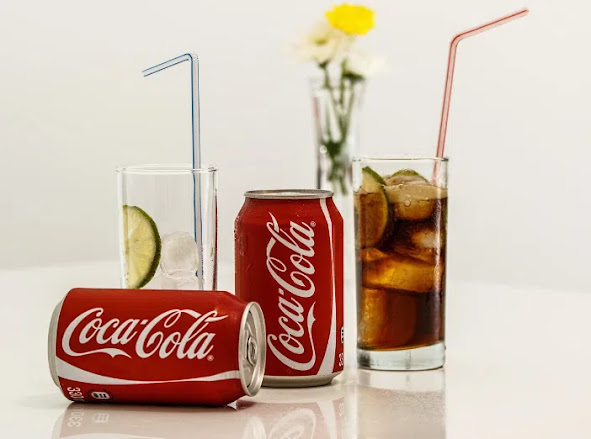
Some discoveries feel impossible to unsee.
A person looks at a Coca-Cola bottle, notices the famous red-and-white logo, and suddenly spots something they never paid attention to before: one of the curved letters appears to look like a smile.
At first, it seems like a small coincidence. Then the more you look, the stronger the impression becomes. The flowing script, the rounded curves, and the famous second "C" in "Cola" all seem to carry a friendly, cheerful energy.
This has led many people online to ask the same question:
Did Coca-Cola hide a smile in its logo on purpose?
The answer is more interesting than a simple yes or no.
There is no strong historical evidence showing that the original Coca-Cola logo was designed with a secret smile. However, the reason so many people see one tells us a lot about design, branding, memory, and the way the human brain searches for meaning in familiar objects.
In other words, the "smile" may not have been intentionally hidden.
But the fact that people see it still matters.
What People Are Seeing in the Logo
The Coca-Cola logo is one of the most recognizable wordmarks in the world.
Its flowing letters have appeared on bottles, cans, vending machines, signs, advertisements, delivery trucks, restaurant menus, holiday commercials, and sports sponsorships for generations.
Because it is so familiar, most people do not truly examine it closely anymore. They recognize it instantly and move on.
But when someone slows down and studies the second "C" in "Cola," something interesting happens.
The shape of the letter curves outward and upward in a way that can resemble a smile. The rounded stroke feels warm and expressive. It does not look cold, mechanical, or sharp. Instead, it has a human quality.
That is what people are reacting to.
The letter does not literally contain a drawn face. There are no eyes, cheeks, or mouth added to the logo. But the curve is enough for the brain to interpret it as a cheerful expression.
Once someone points it out, many people begin seeing the logo differently.
The same thing happens when we spot faces in clouds, animals in rock formations, or expressions in the front of cars.
The image has not changed.
Our perception has.
The History of the Coca-Cola Logo
To understand whether the smile was intentional, it helps to go back to the beginning.
Coca-Cola was created in the late 19th century. The famous name and script logo are commonly linked to Frank Mason Robinson, a bookkeeper for Coca-Cola's inventor, Dr. John Pemberton.
Robinson believed that the two capital C's in "Coca-Cola" would look good in advertising. He also helped create the distinctive script style that became the foundation of the brand's visual identity.
The lettering was based on Spencerian script, a popular style of handwriting in the United States during the 1800s.
Spencerian script was elegant, flowing, and ornamental. It was widely used in business writing, formal documents, and advertising before typewriters became common.
Its curved strokes, sweeping lines, and decorative loops were not unusual at the time. They were part of the visual language of professionalism and refinement.
This is important because the "smile" people see today comes from a style that was already known for dramatic curves and graceful movement.
The logo was not created in the modern era of hidden symbols and viral branding theories. It came from a world where ornate handwriting was common.
Was the Smile Intentional?
Based on available historical information, there is no confirmed evidence that the second "C" was designed to represent a smile.
There is no widely accepted company statement saying, "The C was made to look like a smile."
There is no famous design brief explaining that the curve was meant to create a secret emotional signal.
There is no documented original marketing strategy built around a hidden grin.
That does not mean the idea is foolish.
It simply means the hidden-smile theory is probably a modern interpretation rather than an original design intention.
The logo's friendly feeling may be real, but it most likely comes from the natural beauty of the script, the curves of the lettering, and the emotional associations Coca-Cola has built over time.
Why the Brain Sees a Smile
The human brain is built to recognize patterns.
This ability helped humans survive. Spotting faces, expressions, movement, and familiar shapes quickly allowed people to identify friends, threats, animals, and social cues.
Because this system is so powerful, it sometimes sees patterns even when they were not intentionally placed there.
This phenomenon is called pareidolia.
Pareidolia is the tendency to perceive meaningful images in random or ambiguous visual information.
It is why people see:
- Faces in clouds
- Animals in tree bark
- Eyes in car headlights
- A smile in a curved letter
- Figures in shadows
- Shapes in the moon
The brain prefers meaning over randomness.
When we see two circles and a curved line, we often interpret them as a face. When we see a single curved line in a familiar joyful brand, our brain may interpret it as a smile.
The Coca-Cola logo is especially suited for this because it already feels emotional, nostalgic, and friendly.
Why Curves Feel Friendly
Design psychology plays a major role here.
Rounded shapes are often perceived as softer, safer, and more approachable than sharp shapes.
Sharp angles may feel aggressive, dangerous, fast, or intense.
Curves often feel gentle, warm, relaxed, and human.
The Coca-Cola logo is full of curves.
There are no harsh geometric edges. The letters flow into one another. The script feels smooth and almost musical.
That visual softness supports the idea of happiness and friendliness.
So even if no smile was deliberately hidden, the logo naturally creates emotional warmth.
Coca-Cola's Brand Is Built Around Happiness
Another reason people see joy in the logo is that Coca-Cola has spent more than a century associating itself with happiness.
The brand has long used themes such as:
- Sharing
- Friendship
- Refreshment
- Celebration
- Holidays
- Family moments
- Togetherness
- Nostalgia
- Optimism
When people see the Coca-Cola logo, they are not just seeing letters.
They are also seeing decades of advertising, memories, commercials, music, packaging, and cultural moments.
The mind connects the logo with feelings.
Because the brand identity is so strongly connected to happiness, people are more likely to interpret shapes in the logo as happy too.
The smile may not have created the brand's emotional meaning.
The brand's emotional meaning may have helped people see the smile.
Intent vs. Impact
In design, there is an important difference between intent and impact.
Intent is what the designer planned.
Impact is what the audience experiences.
A designer may create a curve simply because it looks elegant. Years later, millions of people may interpret that curve as a smile.
Does that mean the audience is wrong?
Not necessarily.
Design does not stop belonging to the designer once it enters culture. People bring their own memories, associations, and emotions to what they see.
The Coca-Cola smile may be unintentional, but it still has impact.
If people experience the logo as cheerful, warm, and inviting, then the design is doing something powerful.
Other Famous Hidden Logo Details
The Coca-Cola smile is likely an example of interpretation rather than confirmed intention. However, some logos do include intentional hidden details.
FedEx
The FedEx logo famously contains an arrow in the negative space between the "E" and the "x."
This arrow represents speed, precision, and forward movement.
Unlike the Coca-Cola smile theory, this detail was intentionally designed.
Amazon
The Amazon logo includes an arrow that points from "A" to "Z."
This suggests that Amazon sells everything from A to Z. The arrow also resembles a smile, supporting a friendly customer experience.
Toblerone
The Toblerone logo includes a bear hidden inside the mountain shape.
This references Bern, Switzerland, often associated with bears.
Baskin-Robbins
The Baskin-Robbins logo includes the number 31 within the "BR," referring to the brand's original 31 flavors.
These examples show that hidden details can be real.
But they also show the difference between documented design intention and later public interpretation.
Why Hidden Logo Stories Go Viral
People love hidden details.
They make familiar objects feel new again.
A logo we have seen thousands of times suddenly becomes interesting when someone says, "Look closer."
That small moment of discovery creates surprise.
Surprise encourages sharing.
People send it to friends and ask, "Did you notice this?"
The Coca-Cola logo is perfect for this kind of viral conversation because almost everyone knows it. There is no need to explain the brand. The audience already has a mental image of the logo.
When a hidden detail is suggested, people can test it immediately in their minds.
That makes the post easy to spread.
Is Seeing the Smile "Wrong"?
No.
Seeing the smile is not wrong.
It is a perception.
The key is not to confuse perception with proof.
A person can honestly see a smile in the second "C" without claiming that Coca-Cola intentionally designed it that way.
Both ideas can exist together:
The smile may not be historically intentional.
But the smile may still be visually meaningful to viewers.
That is what makes the topic interesting.
Why Some People Do Not See It
Not everyone sees the smile.
Some people look at the logo and see only letters.
That is normal.
Pareidolia varies from person to person. Some brains quickly detect faces and expressions in abstract shapes. Others focus more on typography, spacing, or literal form.
Perception is personal.
If someone does not see the smile, they are not missing something obvious.
If someone does see it, they are not imagining nonsense.
They are simply responding to the curve in a different way.
The Power of Familiar Design
The Coca-Cola logo has survived because it is memorable.
Many brands change their logos frequently to follow modern trends. Coca-Cola has kept the heart of its wordmark remarkably consistent.
That consistency has given the logo cultural power.
People recognize it across countries, languages, and generations.
Even when the logo appears without a bottle or can, people know what it means.
That kind of recognition is rare.
It comes from repetition, emotional branding, and visual distinctiveness.
The possible smile only adds another layer to that recognition.
What the Logo Teaches About Branding
The Coca-Cola logo shows that great branding is not always about complexity.
Sometimes, a powerful logo works because it feels human.
The script has movement.
The letters have personality.
The curves feel warm.
The design is easy to recognize.
It does not need a complicated symbol beside it.
The name itself becomes the image.
That is one reason the logo remains so effective.
A Happy Accident Can Still Be Brilliant
Some of the best design moments happen accidentally.
A curve may resemble a smile.
A shape may suggest movement.
A space may create a symbol.
A letter may feel emotional without being planned that way.
Designers often refine work based on what feels right, even if every emotional effect is not consciously mapped out.
The Coca-Cola wordmark may not have been built around a secret smile, but its curves support exactly the kind of feeling the brand wants people to have.
That is part of its brilliance.
The Bottom Line
So, is there a hidden smile in the Coca-Cola logo?
Visually, many people see one.
Historically, there is no strong evidence that it was intentionally designed as one.
The most likely explanation is that the "smile" is a combination of Spencerian script, human pattern recognition, and Coca-Cola's long-standing association with happiness.
It is not a confirmed hidden message.
It is a fascinating example of how design and psychology interact.
And perhaps that makes it even better.
Because sometimes the most charming details are not planned.
Sometimes they are discovered.
The second "C" may simply be a letter.
But for many people, it feels like a smile.
And in the world of branding, feeling is often what lasts longest.


Leave a Reply